19 Crimes, the Treasury Wine Estates wine brand has launched a new campaign by J. Walter Thompson San Francisco that is perfectly in tune with their fans’ love of ink.
With #InfamousInk, the brand recruited San Francisco-based tattoo artist Austin Maples to design 19 original illustrations that offer a modern interpretation of the rebellious history that inspired the brands name: In the 1780s, the British government initiated a “punishment by transportation” through which criminals convicted of a list of 19 crimes – from petty larceny to impersonating an Egyptian – were sentenced to live in Australia.
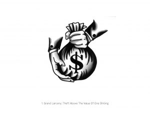 The first illustration for Grand Larceny, crime 1 of 19, was unveiled on April 14 on the brand’s Facebook and Instagram pages. Each week until mid-August, the brand will continue to unveil one illustration alongside a bottle shot themed around that week’s revealed crime and behind-the-scenes footage centering on the artist, his inspiration, and his process.
The campaign kicked off on April 6 with a short teaser film introducing Maples, the man behind the ink, and showing him at work with a bottle of 19 Crimes at his station.
DIVERGE talked to Sean DallasKidd, Executive Creative Director at JWT San Francisco to find out more:
Where did the idea for this campaign come from?
There were two observations that sparked the idea: First, although 19 Crimes has a very passionate and loyal following, we often got questions about specific crimes and second, our followers love their ink and that might not necessarily fit comfortably into category expectations of what a wine drinker looks like. That’s how we began to circle around tattoo. It’s a form of art that tends to denote significant moments in time that stand out in a person’s life, which made us think that it’d be the perfect medium to communicate our story as a brand.
Why is it significant?
Historically the way in which the wine industry communicates is very traditional. We’ve decided to flip expectations and category norms on its head, choosing to communicate in a decidedly non-traditional way, which makes this collaboration stand out. You could say the most “traditional” aspect is the style of tattoo.
How can this campaign make a difference?
It can change assumptions of what a wine drinker looks like. At the end of the day, if this campaign can help open up and diversify the wine world just a little, I’ll be happy.
How did you decide what to get drawn?
The best part about this project was the fact that it was a collaboration. Austin is an amazing artist, so I knew he’d come up with some truly creative solutions. For me, developing a tight brief was the most important component.
Additional thoughts?
I can’t wait to see how the campaign is received. It’d be amazing if someone got a tattoo though!